We can rewrite this in terms of the original data matrix as
\frac{1}{n} \mathbf{\psi}^T \mathbf{\psi} = \frac{1}{n} \mathbf{u}^T X^T X \mathbf{u}
We recognize that X^T X is the covariance matrix of the data.
So the variance of the projected data is given by
\mathbf{u}^T C \mathbf{u},
where C = \frac{1}{n} X^T X is the covariance matrix of the X.
Remember, we want to find the direction \mathbf{u} that maximizes the variance of the projected data.
So we want the direction \mathbf{u} that maximizes \mathbf{u}^T C \mathbf{u}.
Connection
We already solved this problem — just without calling it PCA.
The direction that maximizes \mathbf{u}^T C \mathbf{u} is the eigenvector of C with the largest eigenvalue.
And of course, the eigenvectors of the covariance matrix are the same as the singular vectors of the centered data matrix.
Now we reinterpret them:
before: they were intrinsic geometric directions of the data cloud,
now: they are the best viewing directions for seeing structure.
PCA is simply the viewing interpretation of what SVD already discovered.
Conceptual summary
SVD told us how the data naturally wants to be coordinated.
PCA asks how we should look at the data to understand it.
They are two perspectives on the same object:
SVD — discover the natural axes of variation.
PCA — view the data along those axes.
It is the same geometry, seen through the lens of projection and visualization.
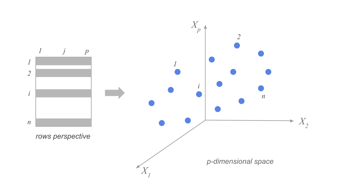
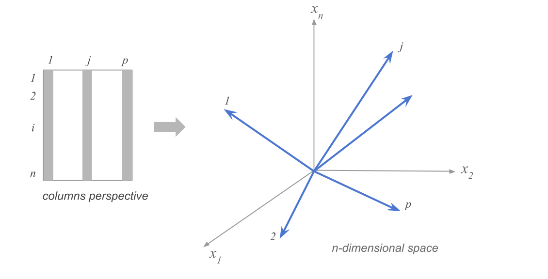
High-dimensional data: variance and projection
Data as points in \mathbb{R}^p, row vs column views, and choosing directions to visualize.
How spread out is the data along a particular direction?
Suppose we have n data points in p dimensions. We can represent the data as a matrix X of size n \times p. The data points are represented as rows in the matrix, and we have subtracted the mean along each dimension from the data.
Visualizing the high-dimensional data
KIDEN
city
region
price_index_no_rent
price_index_with_rent
gross_salaries
net_salaries
work_hours_year
paid_vacations_year
gross_buying_power
...
mechanic
construction_worker
metalworker
cook_chef
factory_manager
engineer
bank_clerk
executive_secretary
salesperson
textile_worker
0
Amsterdam91
Amsterdam
Central Europe
65.6
65.7
56.9
49.0
1714.0
31.9
86.7
...
11924.0
12661.0
14536.0
14402.0
25924.0
24786.0
14871.0
14871.0
11857.0
10852.0
1
Athenes91
Athens
Southern Europe
53.8
55.6
30.2
30.4
1792.0
23.5
56.1
...
8574.0
9847.0
14402.0
14068.0
13800.0
14804.0
9914.0
6900.0
4555.0
5761.0
2
Bogota91
Bogota
South America
37.9
39.3
10.1
11.5
2152.0
17.4
26.6
...
4354.0
1206.0
4823.0
13934.0
12192.0
12259.0
2345.0
5024.0
2278.0
2814.0
3
Bombay91
Mumbai
South Asia and Australia
30.3
39.9
6.0
5.3
2052.0
30.6
19.9
...
1809.0
737.0
2479.0
2412.0
3751.0
2880.0
2345.0
1809.0
1072.0
1206.0
4
Bruxelles91
Brussels
Central Europe
73.8
72.2
68.2
50.5
1708.0
24.6
92.4
...
10450.0
12192.0
17350.0
19159.0
31016.0
24518.0
19293.0
13800.0
10718.0
10182.0
5 rows × 41 columns
Focusing on 12 variables
We might choose to focus on only 12 (!) of the 41 variables in the dataset, corresponding to the average wages of workers in 12 specific occupations in each city.
city
teacher
bus_driver
mechanic
construction_worker
metalworker
cook_chef
factory_manager
engineer
bank_clerk
executive_secretary
salesperson
textile_worker
0
Amsterdam
15608.0
17819.0
11924.0
12661.0
14536.0
14402.0
25924.0
24786.0
14871.0
14871.0
11857.0
10852.0
1
Athens
7972.0
9445.0
8574.0
9847.0
14402.0
14068.0
13800.0
14804.0
9914.0
6900.0
4555.0
5761.0
2
Bogota
2144.0
2412.0
4354.0
1206.0
4823.0
13934.0
12192.0
12259.0
2345.0
5024.0
2278.0
2814.0
3
Mumbai
1005.0
1340.0
1809.0
737.0
2479.0
2412.0
3751.0
2880.0
2345.0
1809.0
1072.0
1206.0
4
Brussels
14001.0
14068.0
10450.0
12192.0
17350.0
19159.0
31016.0
24518.0
19293.0
13800.0
10718.0
10182.0
How can we think about the data in this 12-dimensional space?
Clouds of row-points
Clouds of column-points
Projection onto fewer dimensions
To visualize data, we need to project it onto 2d (or 3d) subspaces. But which ones?
These are all equivalent:
maximize variance of projected data
minimize squared distances between data points and their projections
keep distances between points as similar as possible in original vs projected space
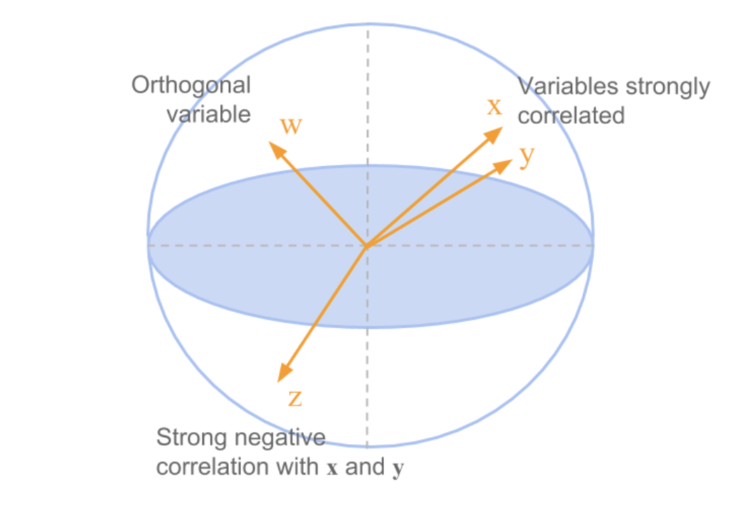
Example in the space of column points
Example
What you should be able to do
Interpret data as clouds of row-points and column-points.
State the goal of projection (maximize variance, minimize reconstruction error, or preserve distances).
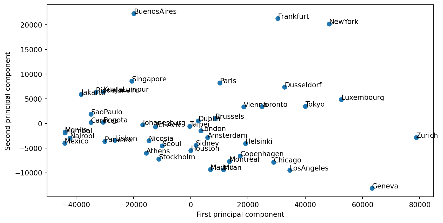
The first principal component
Goal: find the direction of maximum variance; definition and link to eigendecomposition.
Goal
We’d like to know in which directions in \mathbb{R}^p the data has the highest variance.
Direction of maximum variance
To find the direction of maximum variance, we need to find the unit vector \mathbf{u} that maximizes \mathbf{u}^T C \mathbf{u}.
Which direction gives the maximum variance?
The first principal component of a data matrix X is the eigenvector corresponding to the largest eigenvalue of the covariance matrix of the data.
In terms of the singular value decomposition of X, the first principal component is the first right singular vector of X:
\mathbf{v_1}.
The variance of the data along each principal component is given by the corresponding eigenvalue, or the square of the corresponding singular value.
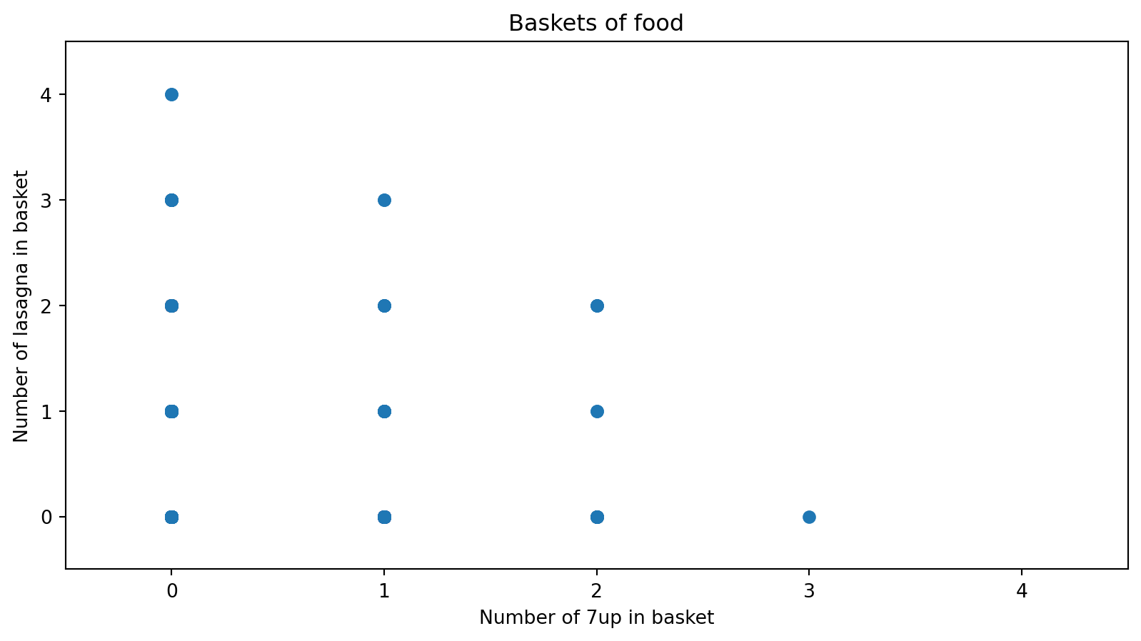
Shopping baskets: exploring high-dimensional data
Load data, visualize in a few dimensions, and look at correlations before PCA.
Motivation
High-dimensional data (e.g. many items per observation) is hard to visualize.
Shopping baskets: 2000 trips, 42 food items — we want to see structure before using PCA.
Strategy: load data → look at 2D/3D views → inspect correlation matrices.
Method
Load the dataset (rows = foods, columns = baskets, or transposed).
Visualize in a few dimensions: scatter plots for two foods, 3D bar charts for counts.
Summarize associations: correlation matrix and heatmap.
Example: Load and inspect the data
0
1
2
3
4
5
6
7
8
9
...
1990
1991
1992
1993
1994
1995
1996
1997
1998
1999
name
7up
0
0
0
0
0
0
1
0
0
0
...
1
1
0
0
0
0
2
0
0
1
lasagna
0
0
0
0
0
0
1
0
1
0
...
0
2
1
0
0
0
0
1
1
0
pepsi
0
0
0
0
0
0
0
0
0
0
...
1
0
2
0
0
2
0
0
0
0
yop
0
0
0
2
0
0
0
0
0
0
...
0
0
0
0
0
1
0
0
0
0
red.wine
0
0
0
1
0
0
0
0
0
0
...
0
0
0
0
2
2
0
0
0
0
5 rows × 2000 columns
2000 observations × 42 variables (number of times each food was purchased per trip).
Goal: visualize in a few dimensions of the original space.
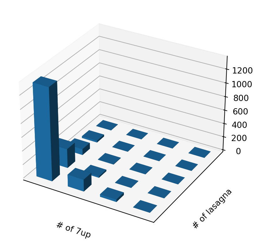
3D view of two-food counts
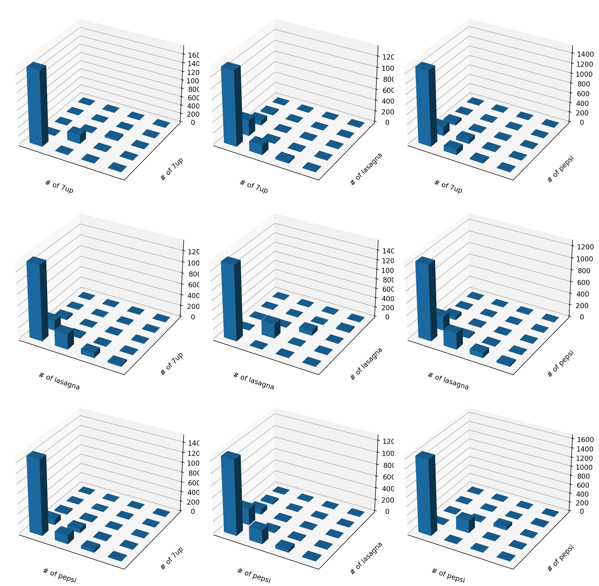
Many pairs of foods
We can look at many combinations.
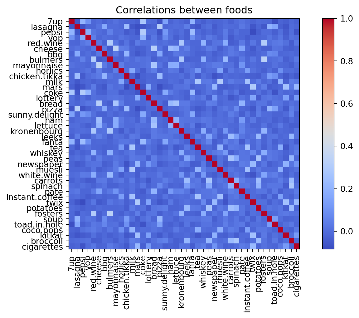
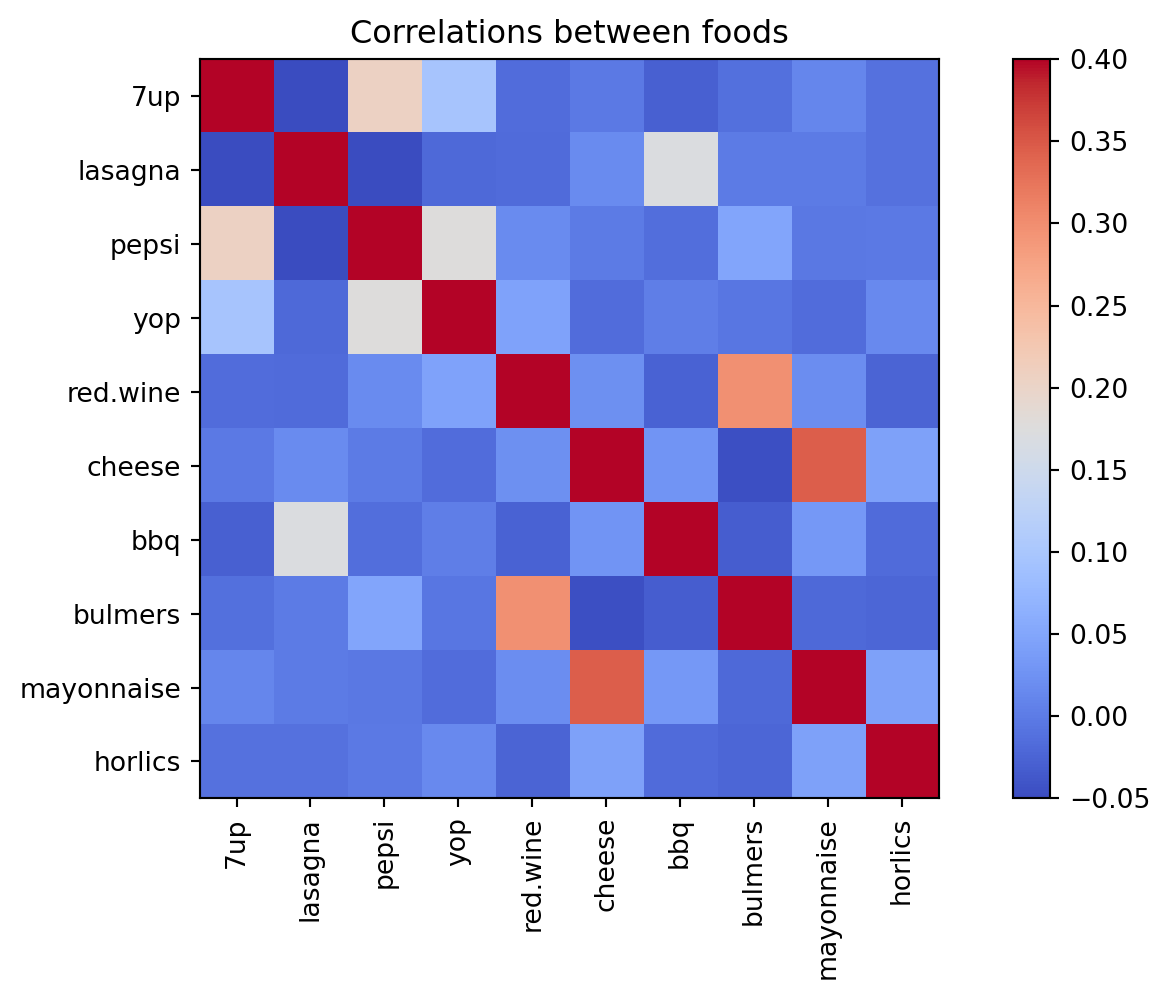
Correlations between foods
Maybe we can learn more from the correlations?
Correlation heatmap (10 foods)
Some patterns are visible, but the full picture is still hard to see.
Next step: standardize and fit PCA to find directions of maximum variance.
PCA gives us new dimensions — but what do they mean? We visualize loadings and scores.
Motivation
PCA reduces dimensions and explains variance.
We want to understand what each principal component captures.
Two key objects: loadings (variables) and scores (observations).
Method: Loadings vs scores
Loadings (components_): each variable’s contribution to each PC. Scatter variables in PC space to see which cluster together.
Scores (transform): each observation’s position in PC space.
Bar plots: order observations by PC value to see who is high or low on each dimension.
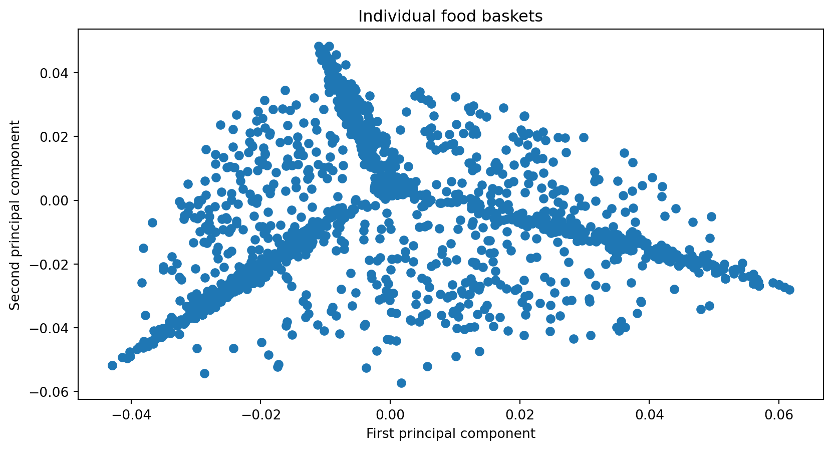
Example: Loadings (variables in PC space)
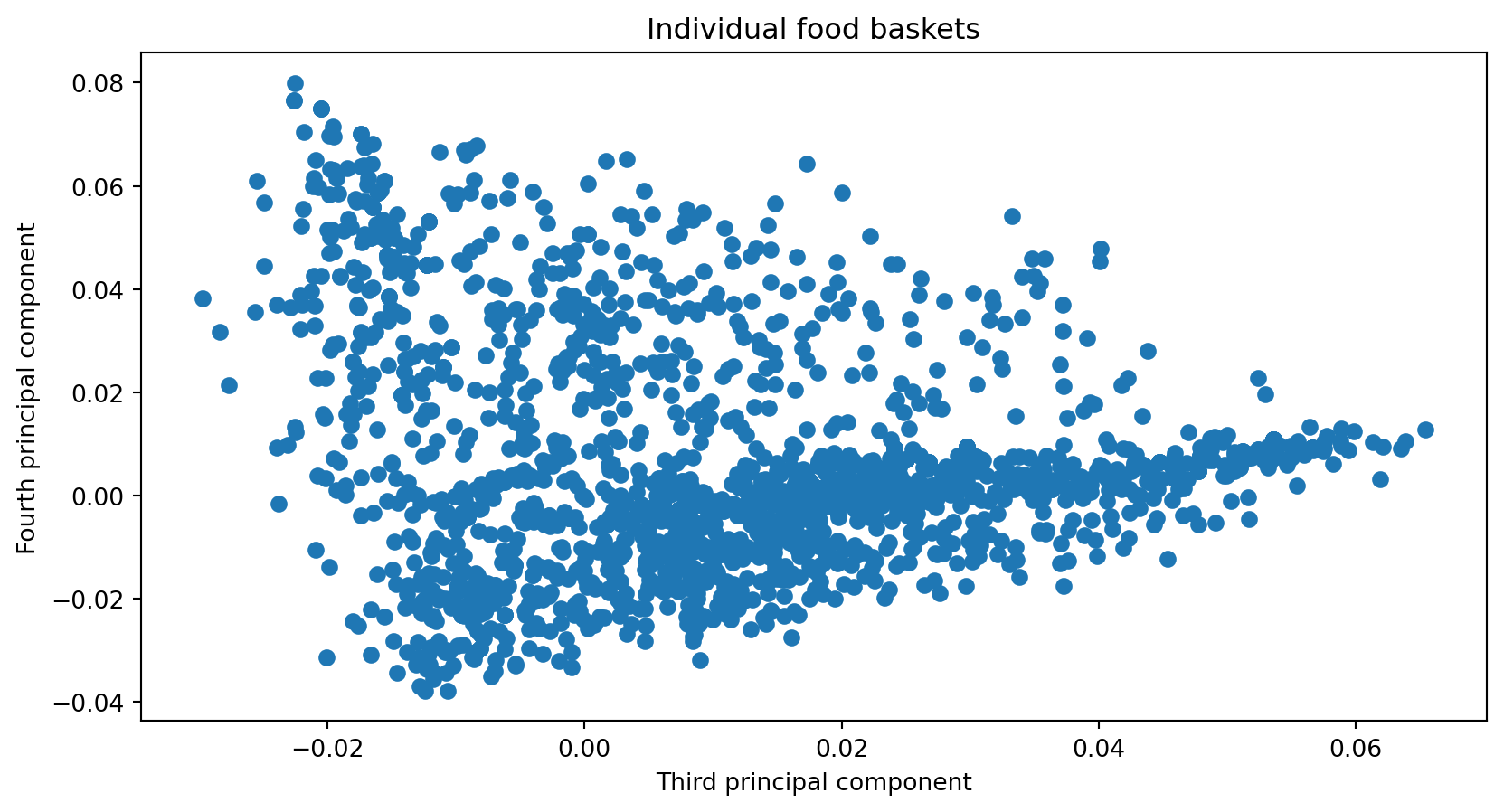
Example: Loadings (PC3 vs PC4)
Example: Scores (individuals in PC space)
Example: Bar plots by PC value
Some real-world data
Applying PCA to genome data to explore population structure.
Motivation
Genome data from multiple populations
Goal: explore whether genetic variation correlates with population structure
Binarize variants and project to principal components
Method — Data pipeline
Read and preprocess: extract population/gender, compute mode per trait (most frequent value)
Binarize: 0 if individual has mode for that trait, 1 otherwise (mutation away from mode)
Fit PCA, transform, append metadata for visualization
Code
def readAndProcessData():""" Function to read the raw text file into a dataframe and keeping the population, gender separate from the genetic data We also calculate the population mode for each attribute or trait (columns) Note that mode is just the most frequently occurring trait return: dataframe (df), modal traits (modes), population and gender for each individual row """ df = pd.read_csv('p4dataset2020.txt', header=None, delim_whitespace=True) gender = df[1] population = df[2]print(np.unique(population)) df.drop(df.columns[[0, 1, 2]],axis=1,inplace=True) modes = np.array(df.mode().values[0,:])return df, modes, population, gender
['ACB' 'ASW' 'ESN' 'GWD' 'LWK' 'MSL' 'YRI']
Examples — Worked pipeline
3
4
5
6
7
8
9
10
11
12
...
10094
10095
10096
10097
10098
10099
10100
10101
10102
10103
0
G
G
T
T
A
A
C
A
C
C
...
T
A
T
A
A
T
T
T
G
A
1
A
A
T
T
A
G
C
A
T
T
...
G
C
T
G
A
T
C
T
G
G
2
A
A
T
T
A
A
G
A
C
C
...
G
C
T
G
A
T
C
T
G
G
3
A
A
T
C
A
A
G
A
C
C
...
G
A
T
G
A
T
C
T
G
G
4
G
A
T
C
G
A
C
A
C
C
...
G
C
T
G
A
T
C
T
G
G
5 rows × 10101 columns
0
1
2
3
4
5
6
7
8
9
...
10091
10092
10093
10094
10095
10096
10097
10098
10099
10100
0
0
1
0
1
0
1
1
0
0
0
...
0
1
1
1
0
0
1
0
0
1
1
1
0
0
1
0
0
1
0
1
1
...
1
0
1
0
0
0
0
0
0
0
2
1
0
0
1
0
1
0
0
0
0
...
1
0
1
0
0
0
0
0
0
0
3
1
0
0
0
0
1
0
0
0
0
...
1
1
1
0
0
0
0
0
0
0
4
0
0
0
0
1
1
1
0
0
0
...
1
0
1
0
0
0
0
0
0
0
5 rows × 10101 columns
Code
pca = PCA(n_components=6)pca.fit(X);#Data points projected along the principal components