How spread out is the data along a particular direction?
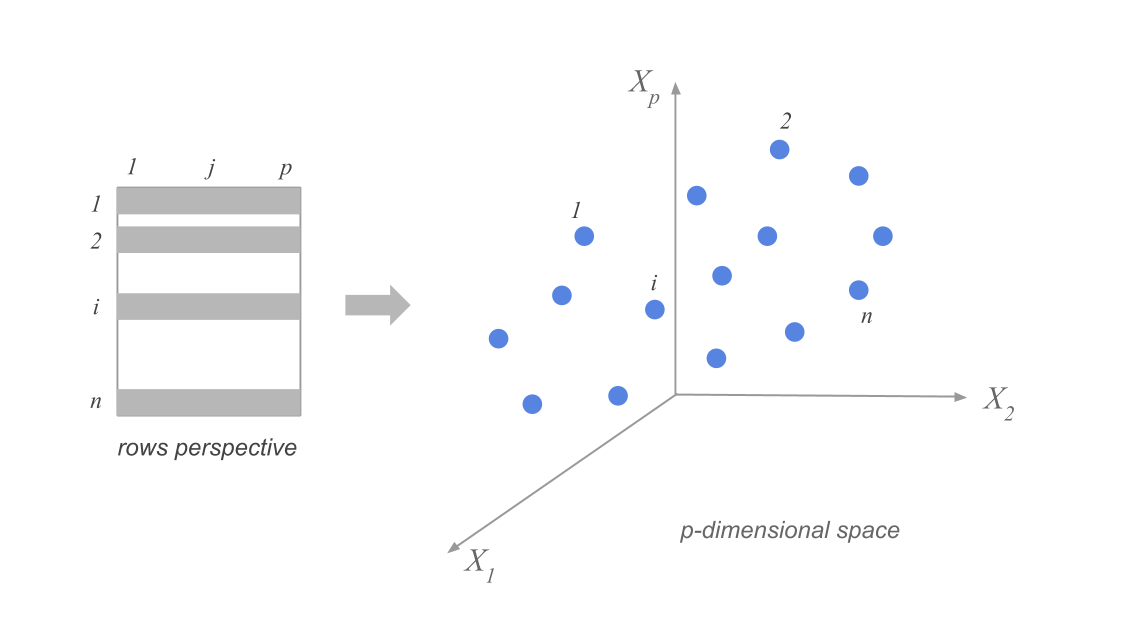
Suppose we have n data points in p dimensions. We can represent the data as a matrix \(X\) of size \(n \times p\). The data points are represented as rows in the matrix, and we have subtracted the mean along each dimension from the data.
Visualizing the high-dimensional data
# load in data from the cities91.csv fileimport pandas as pdimport numpy as npimport matplotlib.pyplot as pltcities = pd.read_csv('cities91.csv')cities.head()
We might choose to focus on only 12 (!) of the 41 variables in the dataset, corresponding to the average wages of workers in 12 specific occupations in each city.
# select only second and then last 12 columnscities_small = cities.iloc[:, [1] +list(range(29, 41))]cities_small.head()
city
teacher
bus_driver
mechanic
construction_worker
metalworker
cook_chef
factory_manager
engineer
bank_clerk
executive_secretary
salesperson
textile_worker
0
Amsterdam
15608.0
17819.0
11924.0
12661.0
14536.0
14402.0
25924.0
24786.0
14871.0
14871.0
11857.0
10852.0
1
Athens
7972.0
9445.0
8574.0
9847.0
14402.0
14068.0
13800.0
14804.0
9914.0
6900.0
4555.0
5761.0
2
Bogota
2144.0
2412.0
4354.0
1206.0
4823.0
13934.0
12192.0
12259.0
2345.0
5024.0
2278.0
2814.0
3
Mumbai
1005.0
1340.0
1809.0
737.0
2479.0
2412.0
3751.0
2880.0
2345.0
1809.0
1072.0
1206.0
4
Brussels
14001.0
14068.0
10450.0
12192.0
17350.0
19159.0
31016.0
24518.0
19293.0
13800.0
10718.0
10182.0
How can we think about the data in this 12-dimensional space?
Clouds of row-points
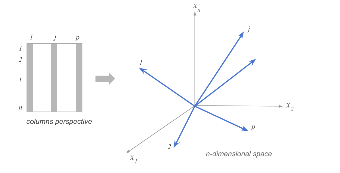
Clouds of column-points
Projection onto fewer dimensions
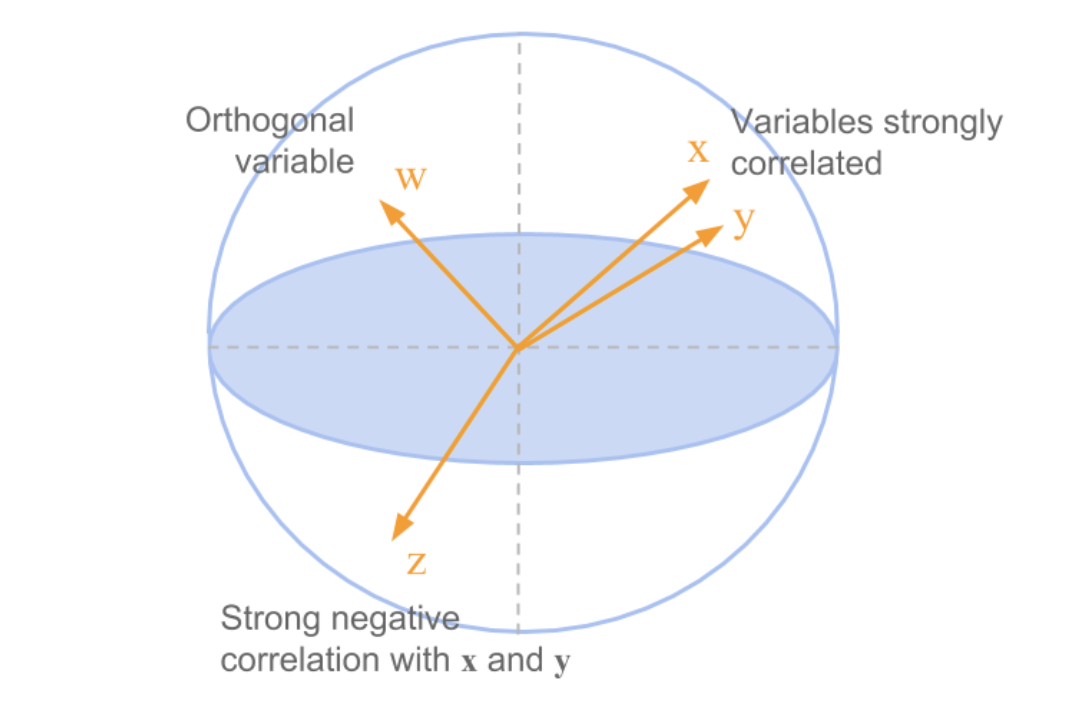
To visualize data, we need to project it onto 2d (or 3d) subspaces. But which ones?
These are all equivalent:
maximize variance of projected data
minimize squared distances between data points and their projections
keep distances between points as similar as possible in original vs projected space
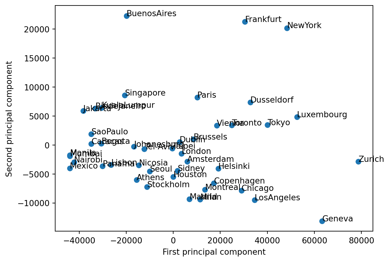
Example in the space of column points
Example
# define the first column of the data as name labels, so that sklearn doesn't use them in the fitcities_small = cities.iloc[:, [1] +list(range(29, 41))]# remove rows with NaN valuescities_small.set_index('city', inplace=True)#names = cities_small['city']#cities_small = cities_small.drop('city', axis=1)# standardize the datacities_small = cities_small.dropna()cities_small = (cities_small - cities_small.mean(axis=0)) cities_small = cities_small.dropna()# find the first two principal components of the datafrom sklearn.decomposition import PCApca = PCA(n_components=2)pca.fit(cities_small)cities_small_pca = pca.transform(cities_small)# plot the data in the new space, labeling each point with the city nameplt.scatter(cities_small_pca[:, 0], cities_small_pca[:, 1])for i, city inenumerate(cities_small.index): plt.text(cities_small_pca[i, 0], cities_small_pca[i, 1], str(city))plt.xlabel('First principal component')plt.ylabel('Second principal component')plt.show()
Goal
We’d like to know in which directions in \(R^p\) the data has the highest variance.
Direction of maximum variance
To find the direction of maximum variance, we need to find the unit vector \(\mathbf{u}\) that maximizes \(\mathbf{u}^T C \mathbf{u}\).
. . . ::: notes We start by finding the eigendecomposition of the covariance matrix \(C\): \(C = V \Lambda V^T\).
\(V\) is a matrix whose columns are the eigenvectors of \(C\), and \(\Lambda\) is a diagonal matrix whose diagonal elements are the eigenvalues of \(C\).
(Note that these are simply the right singular vectors and singular values of the data matrix \(X\).)
Then we can express \(\mathbf{u}\) in terms of the eigenvectors of \(C\): \(\mathbf{u} = \sum_{i=1}^p a_i \mathbf{v}_i\), where \(\mathbf{v}_i\) are the eigenvectors of \(C\). Because \(\mathbf{u}\) is a unit vector, the coefficients \(a_i\) must sum to 1.
Now we have that \(C \mathbf{u} = \sum_{i=1}^p C v_i a_i = \sum_{i=1}^p a_i v_i\), where \(\lambda_i\) are the eigenvalues of \(C\).
So then \(\mathbf{u}^T C \mathbf{u} = \sum_{i,j=1}^p a_i a_j \mathbf{v_j}\mathbf{v_j} = \sum_{i,j=1}^p a_i a_j \delta_{i,j}||v_i|| \lambda_i = \sum_{i=1}^p a_i^2 \lambda_i\). :::
Which direction gives the maximum variance?
pause
. . .
The first principal component of a data matrix \(X\) is the eigenvector corresponding to the largest eigenvalue of the covariance matrix of the data.
In terms of the singular value decomposition of \(X\), the first principal component is the first right singular vector of \(X\):
\(\mathbf{v_1}\).
The variance of the data along each principal component is given by the corresponding eigenvalue, or the square of the corresponding singular value.
Example dataset: shopping baskets
# load in the data from the url, using pandasimport pandas as pdurl ='my_basket.csv'food = pd.read_csv(url).T# name the first column 'name'food.index.names=['name ']#food.set_index('name', inplace=True)food.head()
0
1
2
3
4
5
6
7
8
9
...
1990
1991
1992
1993
1994
1995
1996
1997
1998
1999
name
7up
0
0
0
0
0
0
1
0
0
0
...
1
1
0
0
0
0
2
0
0
1
lasagna
0
0
0
0
0
0
1
0
1
0
...
0
2
1
0
0
0
0
1
1
0
pepsi
0
0
0
0
0
0
0
0
0
0
...
1
0
2
0
0
2
0
0
0
0
yop
0
0
0
2
0
0
0
0
0
0
...
0
0
0
0
0
1
0
0
0
0
red.wine
0
0
0
1
0
0
0
0
0
0
...
0
0
0
0
2
2
0
0
0
0
5 rows × 2000 columns
The data consist of 2000 observations of 42 variables each! The variables are the number of times each of 42 different food items was purchased in a particular shopping trip.
Let’s try visualizing the data in a few of the dimensions of the original space.
. . .
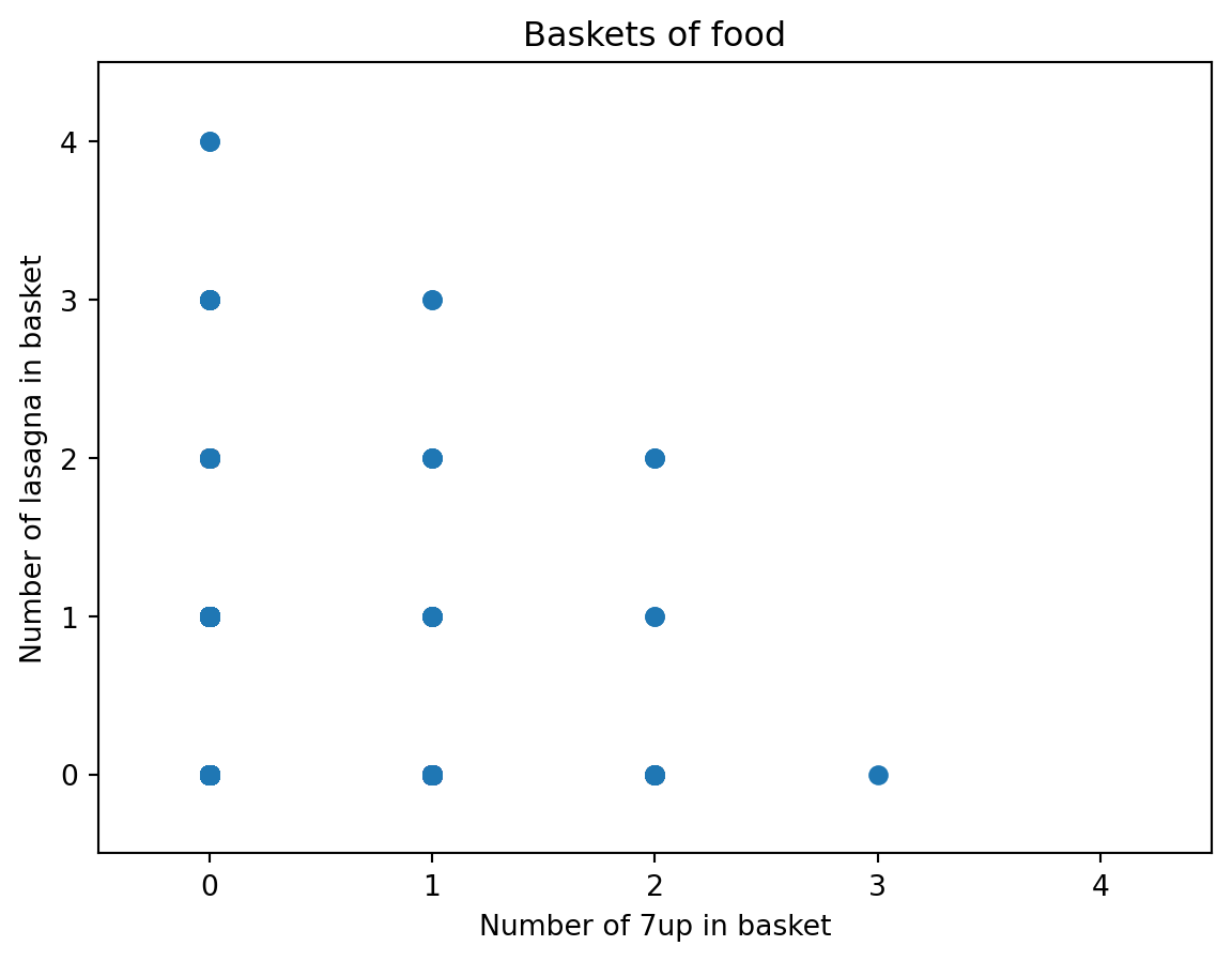
# make a scatterplot of the first two columns in the original datasetplt.scatter(food.iloc[0,:], food.iloc[1,:])plt.xlabel(f'Number of {food.index[0]} in basket')plt.ylabel(f'Number of {food.index[1]} in basket')# calculate the number of observations where the first two coluimns both equal 2.0# increase the max x and max y by 0.5plt.xlim(-.5, 4.5)plt.ylim(-0.5, 4.5)plt.title('Baskets of food')plt.show()
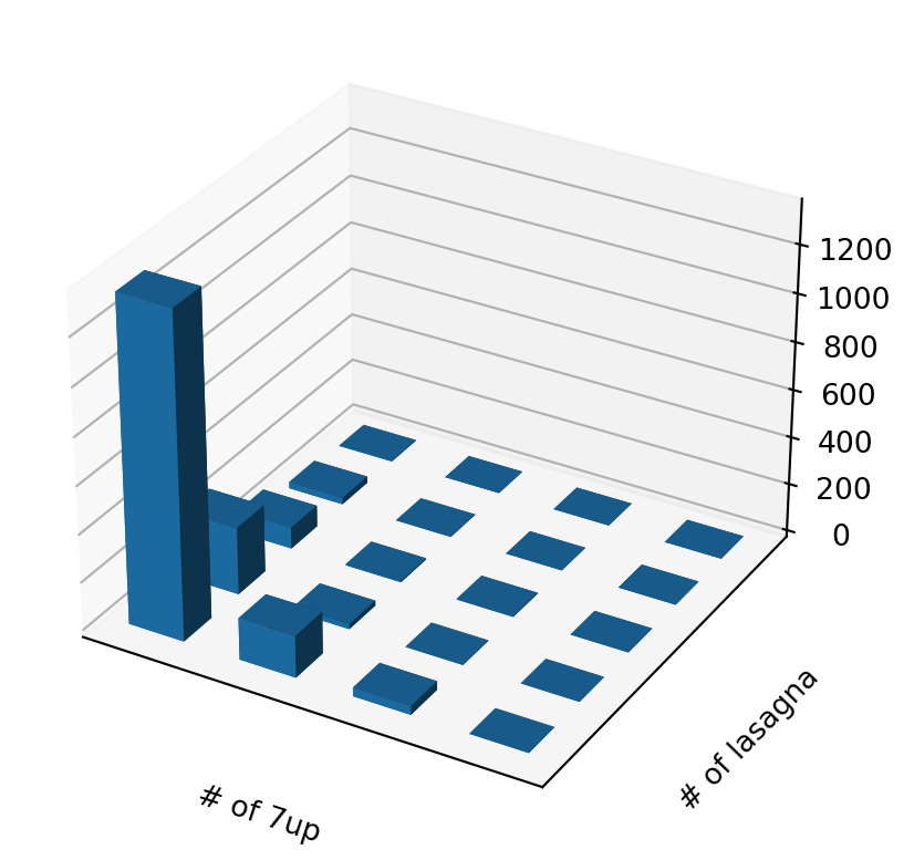
# make a scatterplot of the first two columns in the original datasetdef plot_food_scatter(food, x_col, y_col, ax2=None):if ax2 isNone: no_ax_in =True fig = plt.figure(figsize=(10,5)) ax2 = fig.add_subplot(111, projection='3d')else: no_ax_in =False yval = np.zeros([10,10])for i inrange(4):for j inrange(5): yval[i,j] =sum((food.iloc[x_col, :] == i) & (food.iloc[y_col, :] == j)) xpos, ypos = np.meshgrid(range(4), range(5), indexing='ij') xpos = xpos.flatten() ypos = ypos.flatten() zpos = np.zeros_like(xpos) dz = yval[0:4, 0:5].flatten() dx = dy =0.5 ax2.bar3d(xpos, ypos, zpos, dx, dy, dz, shade=True) plt.xlabel(f'# of {food.index[x_col]}') plt.ylabel(f'# of {food.index[y_col]}')# hide the ticks ax2.set_xticks([]) ax2.set_yticks([])# make the spacing tightif no_ax_in: plt.show()
plot_food_scatter(food, 0, 1)
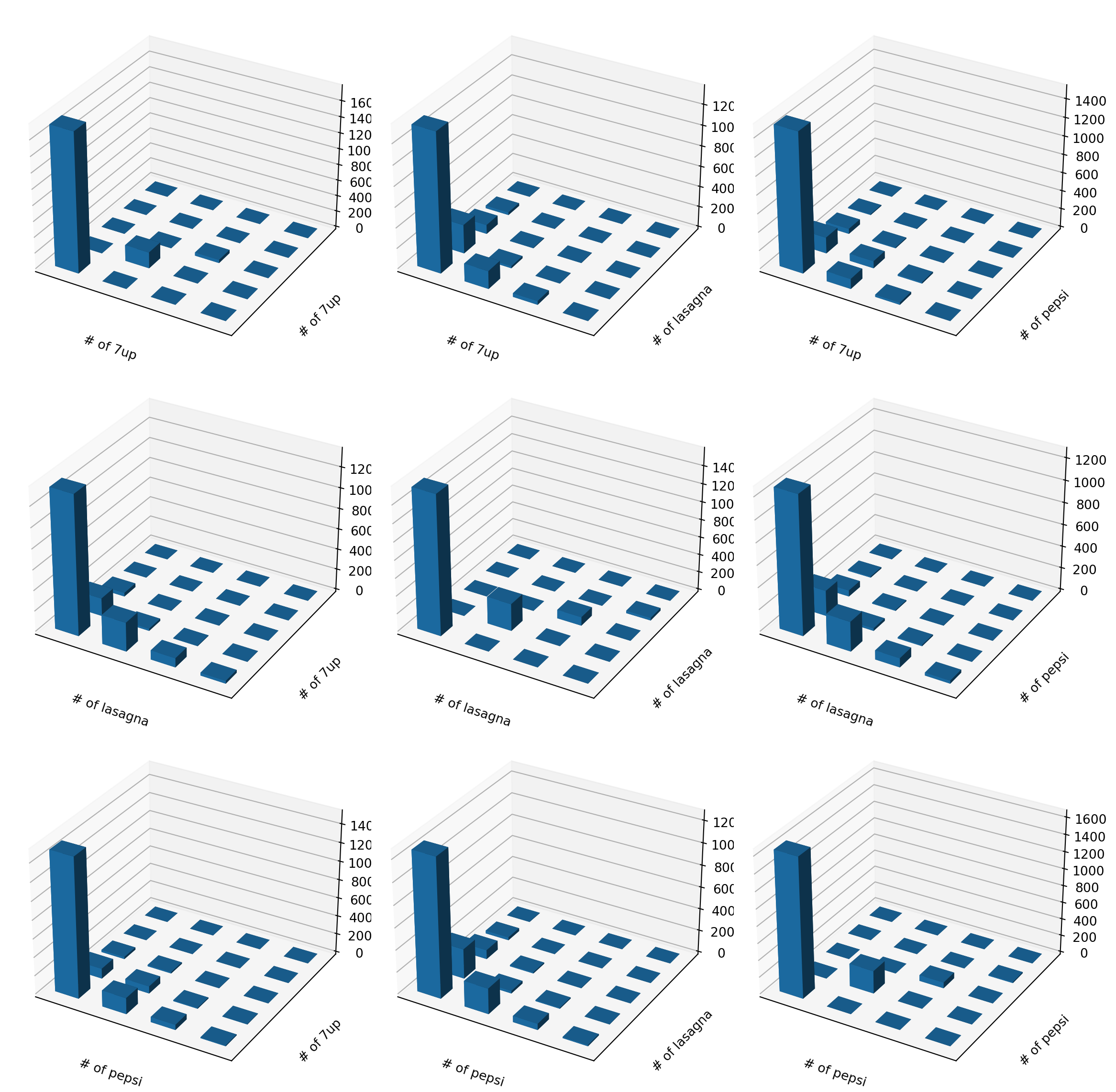
We can look at many combinations…
fig = plt.figure(figsize=(12,12))for i inrange(3):for j inrange(3): ax = fig.add_subplot(3,3,3*i+j+1,projection='3d') plot_food_scatter(food, i, j, ax)plt.tight_layout()plt.show()
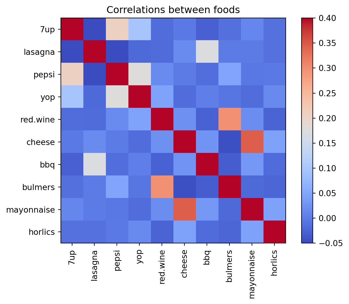
Maybe we can learn more from the correlations?
. . .
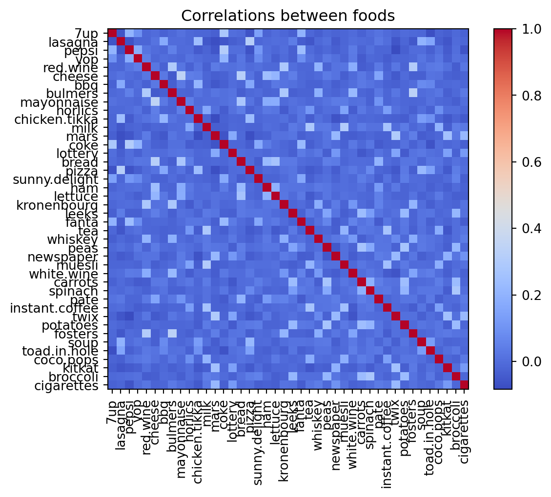
# make a heatmap of the correlations between the columns in the original datasetplt.imshow(food.T.corr(), cmap='coolwarm', interpolation='none')plt.xticks(range(42), food.index, rotation=90)plt.yticks(range(42), food.index)plt.colorbar()plt.title('Correlations between foods')plt.show()
# take just the first 10 foodsfood_small = food.iloc[0:10]# set the range of the colormap to be -0.05 to 0.4plt.imshow(food_small.T.corr(), cmap='coolwarm', interpolation='none', vmin=-0.05, vmax=0.4)plt.xticks(range(10), food_small.index, rotation=90)plt.yticks(range(10), food_small.index)plt.colorbar()plt.title('Correlations between foods')plt.show()
. . .
OK, it looks like there are some patterns here. But it’s hard to get a real sense for it.
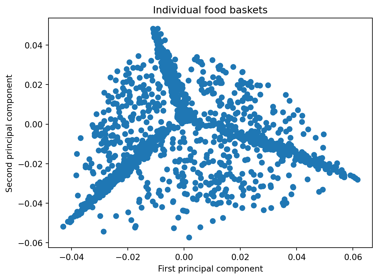
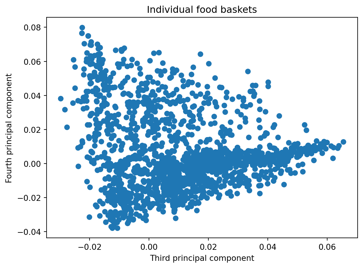
Now perform PCA on the data.
from sklearn.decomposition import PCAfrom sklearn.preprocessing import StandardScaler
# standardize the datascaler = StandardScaler()food_scaled = scaler.fit_transform(food)# find the first four principal components of the datapca = PCA(n_components=4)pca.fit(food_scaled);print(f'Explained variance %: {pca.explained_variance_ratio_*100}')
import plotly.express as pximport plotly.io as pio
plt.scatter(pca.components_[0], pca.components_[1])plt.xlabel('First principal component')plt.ylabel('Second principal component')plt.title('Individual food baskets')plt.show()
pause
plt.scatter(pca.components_[2], pca.components_[3])plt.xlabel('Third principal component')plt.ylabel('Fourth principal component')plt.title('Individual food baskets')plt.show()
# plot just the first principal component# sort by the first principal componentdef plot_by_pci(i): food_sorted = food_pca.sort_values(by=f'Principal Component {i}') fig=px.bar(food_sorted, x=f'Principal Component {i}', text=food_sorted.index, orientation='h',color=f'Principal Component {np.mod(i+2,2)+1}', template='simple_white')#fig.xticks(rotation=90)#fig.ylabel('Projection on first principal component') fig.update_layout(yaxis={'visible': False, 'showticklabels': False}, xaxis={'visible': True, 'showticklabels': True}) fig.show()
def readAndProcessData():""" Function to read the raw text file into a dataframe and keeping the population, gender separate from the genetic data We also calculate the population mode for each attribute or trait (columns) Note that mode is just the most frequently occuring trait return: dataframe (df), modal traits (modes), population and gender for each individual row """ df = pd.read_csv('p4dataset2020.txt', header=None, delim_whitespace=True) gender = df[1] population = df[2]print(np.unique(population)) df.drop(df.columns[[0, 1, 2]],axis=1,inplace=True) modes = np.array(df.mode().values[0,:])return df, modes, population, gender
def convertDfToMatrix(df, mode):""" Create a binary matrix (binarized) representing mutations away from mode Each row is for an individual, and each column is a trait binarized_{i,j}= 0 if the $i^{th}$ individual has column $j$’s mode nucleobase for his or her $j^{th}$ nucleobase, and binarized_{i,j}= 1 otherwise """ raw_np = df.to_numpy() binarized = np.where(raw_np!=modes, 1, 0)return binarized
X = pd.DataFrame(convertDfToMatrix(df, modes))X.head()
0
1
2
3
4
5
6
7
8
9
...
10091
10092
10093
10094
10095
10096
10097
10098
10099
10100
0
0
1
0
1
0
1
1
0
0
0
...
0
1
1
1
0
0
1
0
0
1
1
1
0
0
1
0
0
1
0
1
1
...
1
0
1
0
0
0
0
0
0
0
2
1
0
0
1
0
1
0
0
0
0
...
1
0
1
0
0
0
0
0
0
0
3
1
0
0
0
0
1
0
0
0
0
...
1
1
1
0
0
0
0
0
0
0
4
0
0
0
0
1
1
1
0
0
0
...
1
0
1
0
0
0
0
0
0
0
5 rows × 10101 columns
pca = PCA(n_components=6)pca.fit(X);#Data points projected along the principal components